


Why looks matter
Summer Edition #1

Invisible to customers
For almost 100 years, Disney has been the master of creating stunningly deceptive visual fantasy worlds, in movies and also in their theme parks.
But, did you know their genius extends to inventing proprietary colours that make parts of their theme parks that they don’t want you to pay attention to ‘disappear’?
Here’s “Blending Blue” which allows tops of functional buildings to be less apparent.

And, here’s “Go Away Green” which turns utility poles and boxes into a shade that blends with the foliage around.

This is a little like an airline hiding its crew rest bunks on a jet, or a hotel operating its service areas entirely separately, with their own elevators and entrances. One of my clients is a state Art Gallery, which makes a bold statement with its art works when it invites guests through its grand entrance, while staff (and goods) make their way there via a labyrinthine loading dock out the back.
Question: What essential aspects of your business need to be invisible to your customers?
Untangling
We’ve only been creating information for about 40,000 years, when humans first daubed rocks and caves with pigments. Since then, density of information has accelerated and spread dramatically at three points: when writing was invented (3000 BCE), when printing began (15th century CE), and with digitisation (20th century).
And, today, we’ve fallen into a fallacy that says, essentially, “Everything can be turned into information”.
Well, not quite.
Take a look at this visual description of factors that contribute to geopolitical stability in Afghanistan.

And this UK Government report, which describes factors in children’s wellbeing.

If I asked you, “What are the levers for change here?”, I think you’d find it hard to answer for either of these.
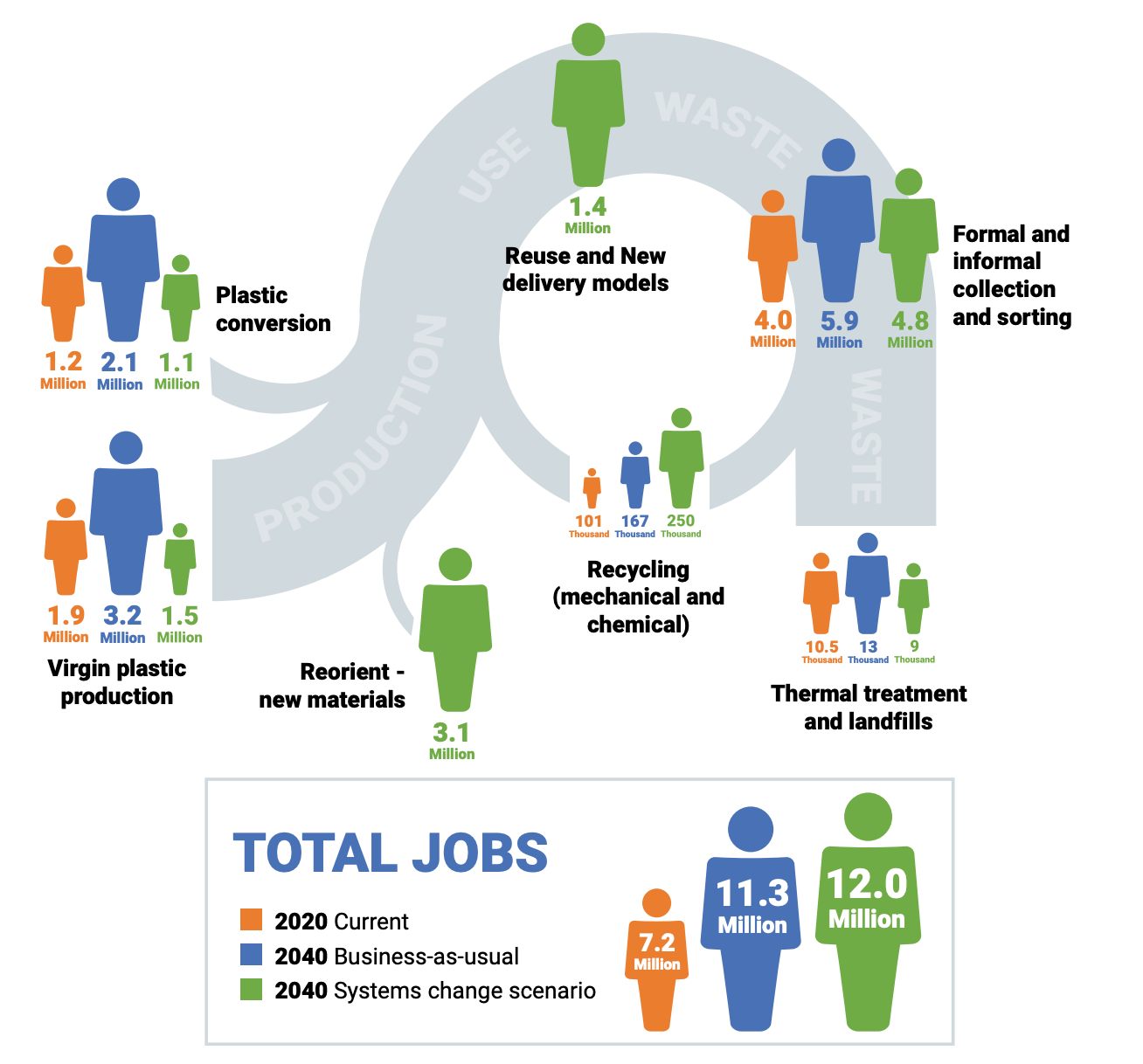
By contrast, look at this work that my client, the UN’s Environment Programme, is midway through negotiating: a global treaty to eliminate plastic waste. This circular graphic turns something very complex into something very simple: just seven points in a circular economy where action can be taken.

This simplicity then allows us to visualise two different scenarios: one where our current use of plastics continues unabated, and another where each of those seven strategic points are addressed through concerted action by governments and industry.

But, there’s more. The same circular schema can then be used to describe other consequences, like changes in workforces needed.
My message, whether to the UN, or much smaller clients, who routinely deal with complex networked effects, is to force a distillation down to their essence.
Find the simplest relationships between parts, even if you’re not accounting for all variation, or all parts. And highlight, visually, the nodes, or points for action. Lastly, stress-test it by asking, “Does this work as both a diagnostic and a prescriptive?”
Question: What multi-dimensional complexities in your line of business can you reduce to their critical elements only?
Getting Powerpoint right
While we’re talking visuals, have you ever seen someone get Powerpoint totally wrong?
I certainly have. And, I’ve also seen more dismal Powerpoint than most, as I’m often asking my clients and other experts to put together insights for use in conferences and strategy meetings.
The main failure points? Here are the big three:
Treating a slide as a script, which they simply read out.
Putting too much text onto one slide, so it can’t be read from beyond the front row.
Putting multiple charts and graphs on one slide, with unclear labelling.
And, this beggars belief, but I’ve also seen presenters say words to this effect: “Actually don’t worry about this next slide. I’ll just explain in brief what it shows.”
Yes, well. Why didn’t you do that in the first place?
My solution?
It’s to be quite prescriptive, even pedantic, about creating a deck that has a narrative flow.
I routinely give presenters “Andrew’s Six Rules of Powerpoint” but, even more important is my guidance on how to structure the information. For instance, in a presentation where an insight is being conveyed, here’s the ideal narrative flow:
Start with the result or outcome (grab participants’ attention from the outset with a headline) - 1 slide
Describe problem or issue (engage participants’ empathy with the dilemma you’re solving) - 1 slide
Give overview of method of resolution or recommendations (the principle here is “Tell them what they need to know, not everything I know”) - 2/3 slides
Finish with insights, learnings, consequences, ‘a-ha’ realisations, takeaways, or recommendations - 1 slide
Your aim is to show, not tell; engage, not lecture. And, to convey enjoyment, enthusiasm or invigoration while doing so.
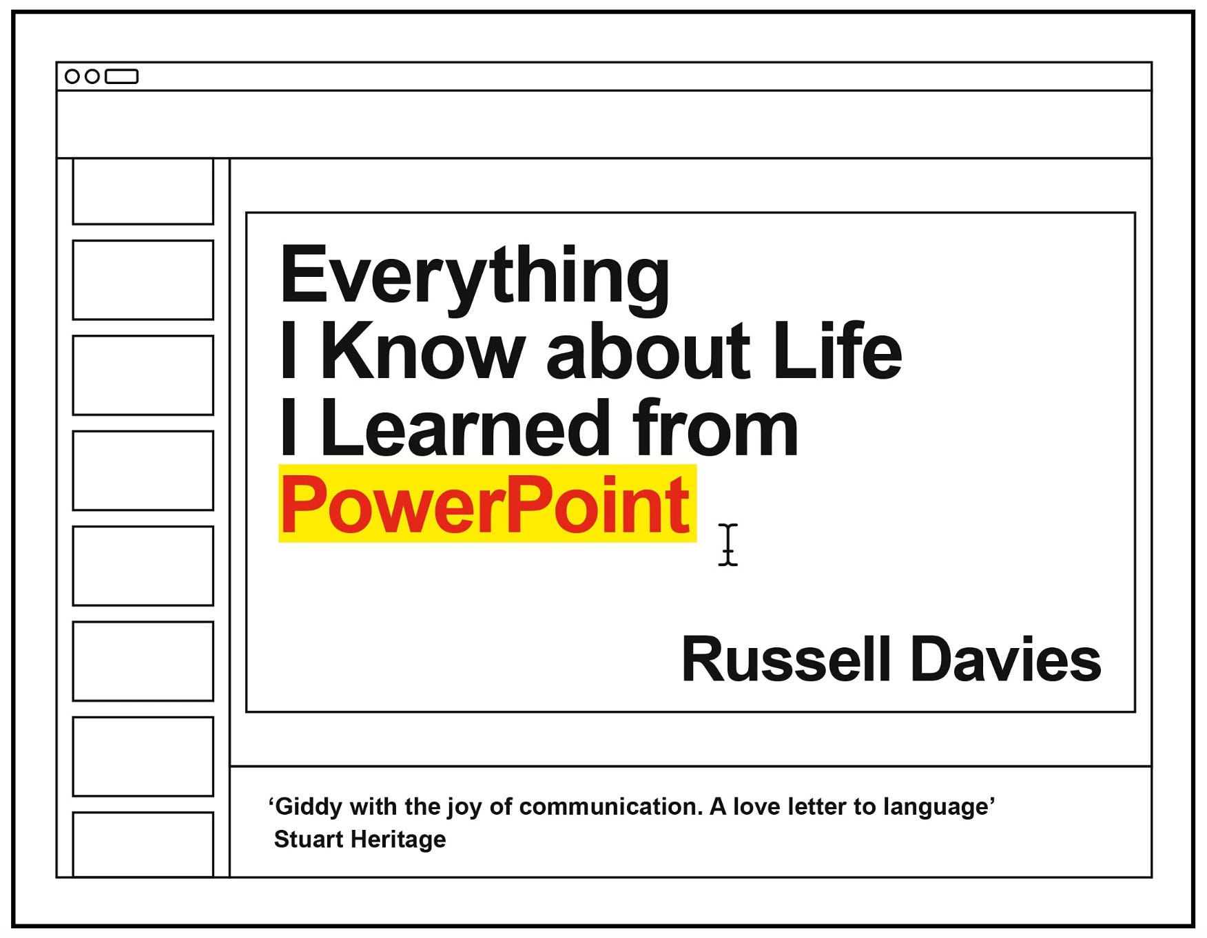
And, as a little extra something, here’s a recommendation for a wonderful book called, “Everything I Know About Life, I Learned from Powerpoint”, by Russell Davies, a designer who’s created slides for Apple, Nike and even Microsoft themselves. It’s half hilarity, half philosophy. Highly recommended.
Question: How can you turn your presentations into narratives?
Please click the ‘heart’ as I do like knowing that you’re enjoying reading, and so do the Substack bots.
Until we meet again next Friday, have a great week.
Andrew