Disclaimer: This isn’t about the US Presidential election. Really. It’s about interpreting data to gain strategic insights. Keep reading.
Knock knock
I was shocked.
Not about the winner. But about this.
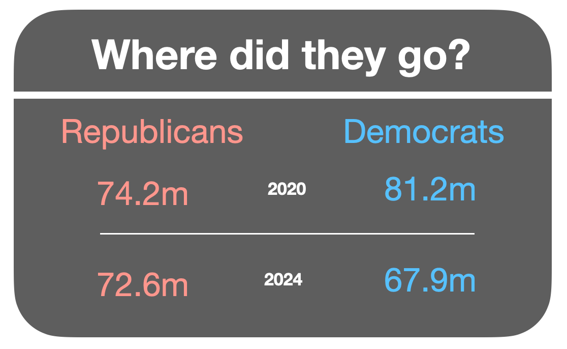
Fewer people voted for Donald Trump this time than did in 2020. But a LOT fewer people voted Democrat (some 16% less, or 13 million votes).
So what did the Democrats do wrong to let 13 million former voters slip through their fingers? Look at the data above - they only needed to keep HALF of them.
Well, we know what the Republicans did right. With 175 million of Elon Musk’s dollars, they went door knocking in the three months prior. Literally door to door — to 11 million homes, ALL in the seven battleground states. You can’t argue with that as a tactic.
Question: What are you doing to mobilise your equivalent of 13 million people, and to ensure you stay connected with them?
A picture is worth a thousand words
We are now certainly all familiar with the US’s Electoral College, and how an entire state’s majority vote carries all of that state’s College votes with it. Get to 270 College votes, and the Oval Office is yours.
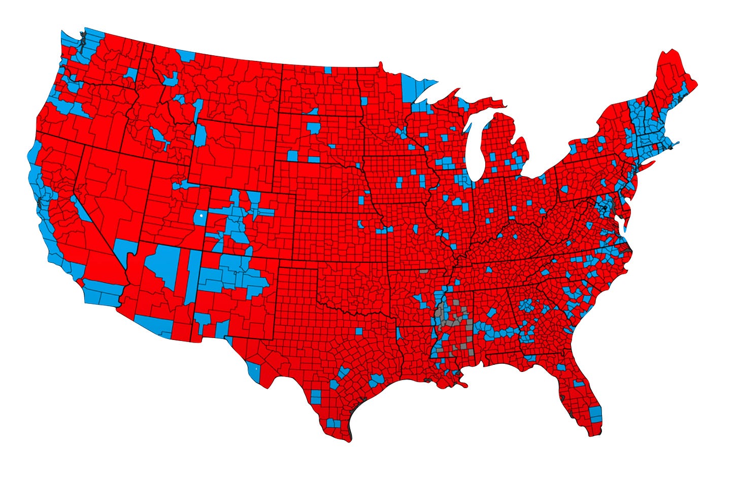
But, even more interesting than the State level is this map. This is the voting pattern at the county level, all 3,144 of them.
At first glance, you think, “What a sea of red!”
But, a better question is, “What do the blue areas represent?”
They illustrate the sharpest divide of all: America’s cities.
Last night I diligently hovered my cursor over probably half of the counties of the US in the New York Times’s fabulous interactive map and I set myself a challenge: find ANY city in the US of more than 250,000 that voted Republican.
I could only find TWO (Phoenix and Oklahoma City in case you’re interested). Even in ‘deep red’ states the cities are blue: Tennessee voted 65% in favour of Trump (but its two cities of Nashville and Memphis didn’t); same pattern in Alabama (with Birmingham and Montgomery).
So, this is a case where the high level map misleads us into thinking this was a whitewash (or redwash). Yes, it was, but only in rural areas. You need to look deeper to find the true story.
Question: When does an overview give you the wrong strategic conclusion, whereas a more detailed view might give you better insights?
Do we know who our supporters are?
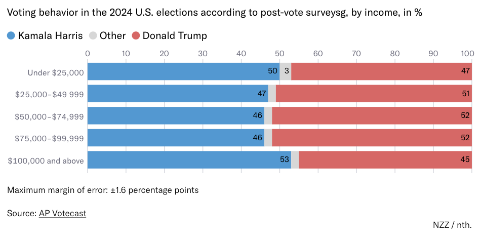
So, I now know how many turned up to vote, and where they live. But I still don’t know who those 72 million Trump voters were.
Are they particularly rich, or poor? No.
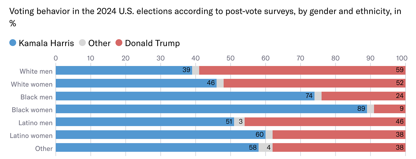
Even racial patterns tell a mixed story, with the exception of black voters:
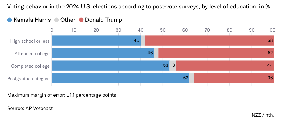
But here’s one that’s unambiguous: education levels.
The more years you’re educated the more likely you are to vote Democrat. Why? There’s a lot of data that tells us that education gives people a propensity for socially liberal ideas (some call these ‘woke’), so that makes sense.
But, I wonder whether we’re also seeing a conflation of the three strongest polarising factors above: if you’re black, and/or educated, you’re more likely to live in a city. If you live in a city, you’re almost certain to vote Democrat.
Question: If you were advising the Democrats on how to win the next election, how would you use this data to strategise over the next four years?
What works for them won’t work for us
Here’s a little bonus, while we’re talking US election data.
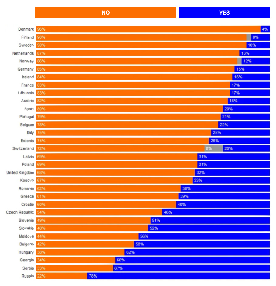
The bar chart below shows the results of ONE question asked of Europeans in the past month. It shows how variable these countries are. Can you guess the question, just by looking at the countries at the top and bottom?
The question was, “Would you vote for Donald Trump?”
Case closed.
Have a great weekend and I’ll see you next week.
Drop me a heart click if you’ve enjoyed reading!
Andrew


Nice analysis Andrew - thanks for the share...
Thanks Andrew for the insight.
Interesting that we have just got the results of our local government elections. Living in rural Victoria I can see a similar trend.